Man City Homepage
City Football Group 2025 - A facelift for an ageing homepage
My Role
Product Designer: UX Design, Visual Design, Prototyping
Timeline & Status
2 weeks
Overview
While working at City Football Group, I was briefed to redesign the Manchester City homepage to rival best-in-class competitors, optimising the experience across desktop which would then be responsive and feed into the mobile platforms.
My role focused on interaction design and prototyping within an agile, cross-functional team where I collaborated with designers and engineers.

HIGHLIGHTS
A well earned refresh for an ageing homepage
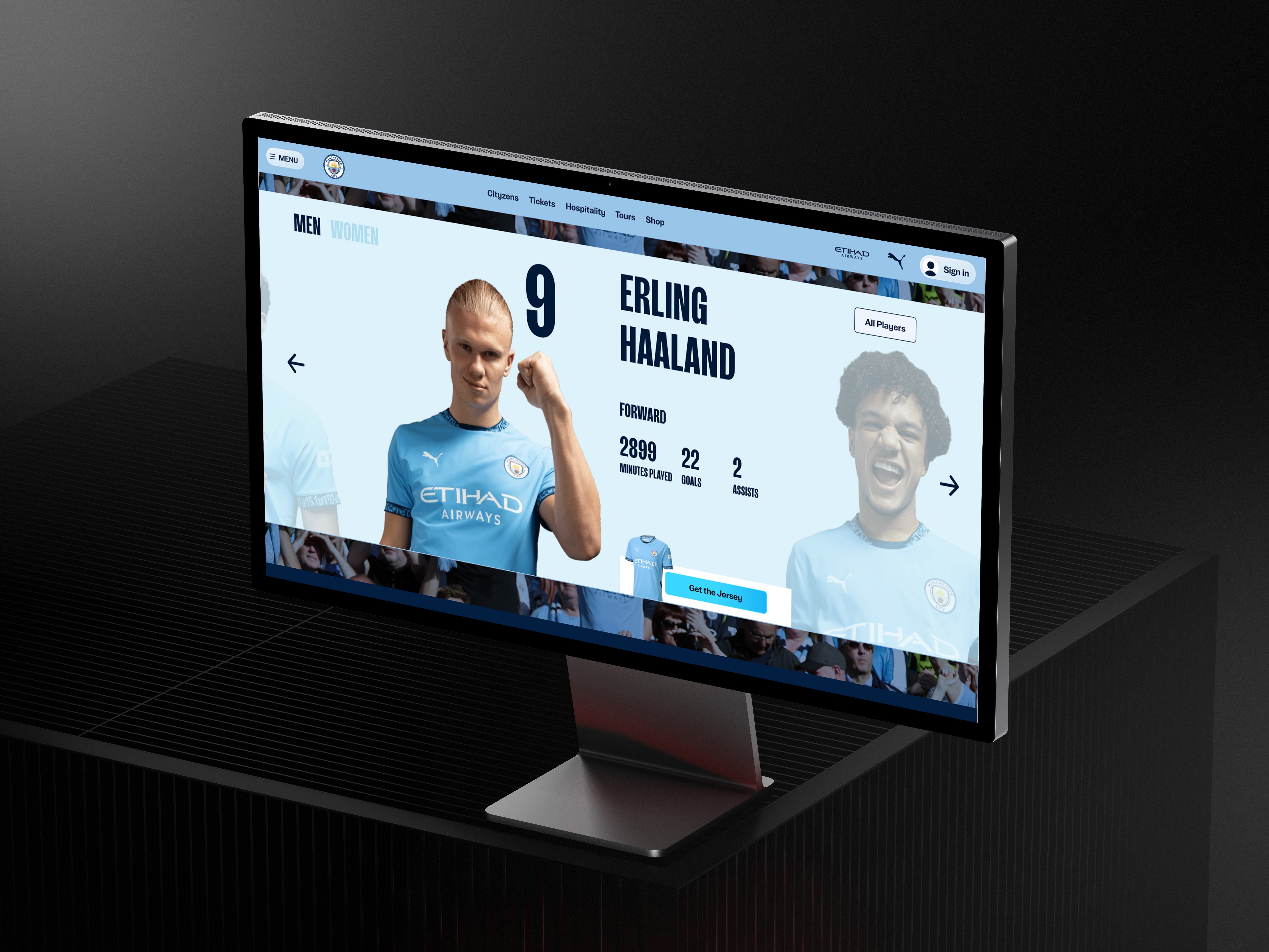
0.1 Homepage Mockup

0.2 Home Screens
CONTEXT
An outdated first impression
A 15 year old homepage which hadn’t moved with the times
As a team, we faced the challenge of modernising a 15-year-old homepage, stuck in outdated design paradigms. Its static layout and legacy conventions hindered engagement. Redesign iterations introduced a tension between preserving existing elements and introducing fresh, innovative solutions

1.0 Analysing the current homepage
PROBLEM SPACE
Raising the bar for 2025
Benchmarking to inform a Superior User Experience
We conducted an extensive competitor analysis, scrutinising best-in-class homepages to benchmark the existing homepage against industry leaders. This process revealed critical gaps and opportunities, guiding us to brainstorm innovative features and superior user experiences which could be introduced

2.0 Analysing competitor homepages
Less is more
Consolidate links and extraneous information to declutter the overall appearance and navigation

Delight Fans
Prioritise fan engagement with immersive storytelling that celebrates the club’s culture

Enhance Visual Impact
Introduce modern UI components to create a contemporary and intuitive layout

Retain Brand Integrity
Preserve City’s distinctive colour scheme and blueprint design system
2.1 Key Takeaways
WIREFRAMES
From Insights to Interface
Harnessing insights to shape an intuitive, user-centric flow
During the design phase, we sketched out detailed wireframes to map the homepage’s scroll flow from top to bottom.
Rapid, iterative reviews refined the layout, ensuring smooth user navigation. The approved sketches were then translated into mockups using the Blueprint Design System in Figma
3.0 Initial Sketches
VISUAL DESIGN
Working within a Design System
Translating Wireframes into Interfaces
Leveraging the blueprint design system, we transformed our approved wireframes into modern, fan-focused interfaces. Each section was reimagined with a contemporary aesthetic and clear UI logic that rivals other best in class football homepages. The system’s modular components enabled seamless integration, delivering a homepage experience that’s visually engaging, up-to-date, and resonates with fans
4.0 City’s evolving Design System: Blueprint
4.1 Homescreen Hero Landing Page Logic
4.2 Homepage Tickets Screen Logic
4.3 Homepage Footer Logic

4.4 Homepage UI Design within Blueprint
PROTOTYPING
Prototyping
A clickable prototype to test with users
To test the design, I built a clickable prototype, allowing users to experience the core flows and interactions across all app screens.
I then conducted usability testing with participants from the original UX research, gathering insights on ease of use, feature engagement, and any pain points, ensuring the design met user expectations
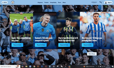
5.1 Homescreen Mockup

5.2 Homescreen Mockup
5.3 Internal Design Review
Internal feedback prior to launch
Gathering early feedback was crucial to pinpoint pain points and fine-tune the Manchester City homepage before launch. While the streamlined layout and strong brand identity might resonate with fans, it also highlights opportunities to improve accessibility, legibility, and visual presentation—ensuring every fan can engage with the experience
ITERATIONS
Implementing Feedback
Ensuring Design Improvement
During internal feedback, three main themes emerged: refining kit link visuals, optimising search bar placement and legibility, and unifying the news cards’ navigational elements for a more cohesive and accessible experience.
6.0 Reduce Text Heavy Cards
Streamline Kit Links
Feedback revealed that the city kit links were overly text heavy, detracting from visual appeal. We reduced the text to create a cleaner, more engaging design that better suits a homepage layout, allowing imagery and concise copy to capture attention more effectively.
6.1 Making search more accessible
Optimise Search Placement
Team input stressed the need for a more prominent search feature. We positioned the search bar at both the top and bottom of the homepage and enhanced text contrast against the background. This change improves legibility and streamlines navigation, making it easier for users to find what they need.

6.2 Improving visibility and hierarchy of news cards
Unified News Cards
While the new news cards were contemporary and clickable, feedback indicated that their navigation arrows and buttons felt disjointed. We refined these elements, integrating them seamlessly into the overall design.
Project Takeaways:
Fan-Centric Strategy
Early competitor analysis ensured design decisions were rooted in a fan-first philosophy

Blueprint Integration
Utilising a robust design system preserved brand integrity while modernising the UI

Iterative Evolution
A rapid, iterative process allowed us to continuously refine layout and visual elements
Enhanced User Experience
Improvements in accessibility, legibility, and visual hierarchy delivered a dynamic homepage
7.0 Project Takeaways