Flarely
iOS app to manage, track & control eczema symptoms

My Role
Lead Designer: Feature Scoping, Research, Interaction Design, Visual Design, Brand Identity, Prototyping
Timeline & Status
2 months
Overview
End to end product design for iOS native app prototype.
Flarely in an app for mobile, designed to empower users to track, manage, and alleviate symptoms of Topical Steroid Withdrawal through personalised monitoring and data insights.
This project was designed and prototyped using Figma, FigJam, and Adobe Creative Suite to deliver a useful and engaging product.

HIGHLIGHTS
A full stack healthcare app prototype that allows users to manage their skin journey

0.1 App Prototype
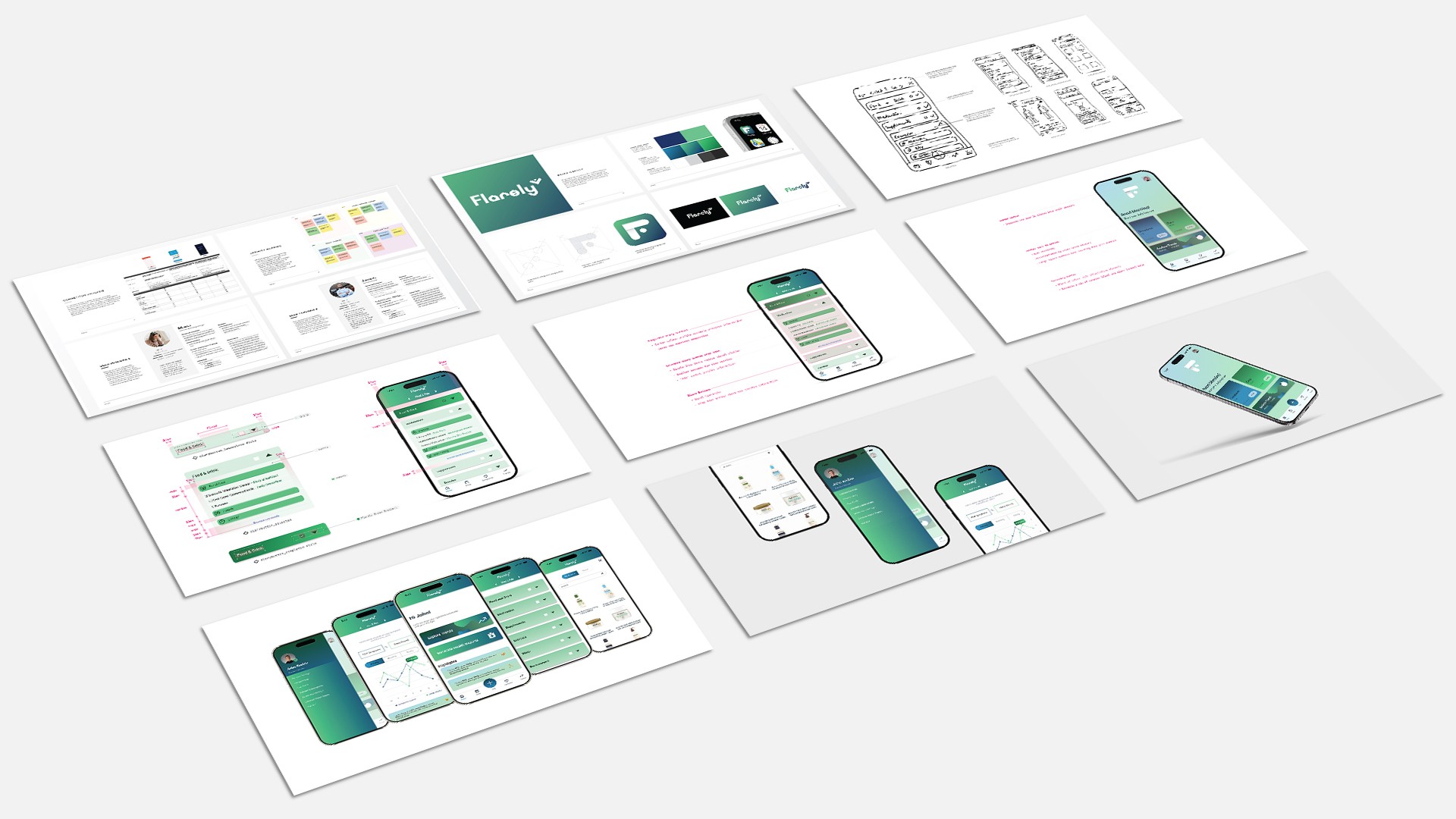
0.2 Visual Design
0.3 App Screens
CONTEXT
A Growing Healthcare Issue
The opportunity to regain control over skin health
A growing body of evidence is showing that Topical Steroid Withdrawal (TSW) for people with eczema is a problem within the field of dermatology. There is a clear need for people with eczema who might be suffering from this condition to be able to manage their skin effectively.
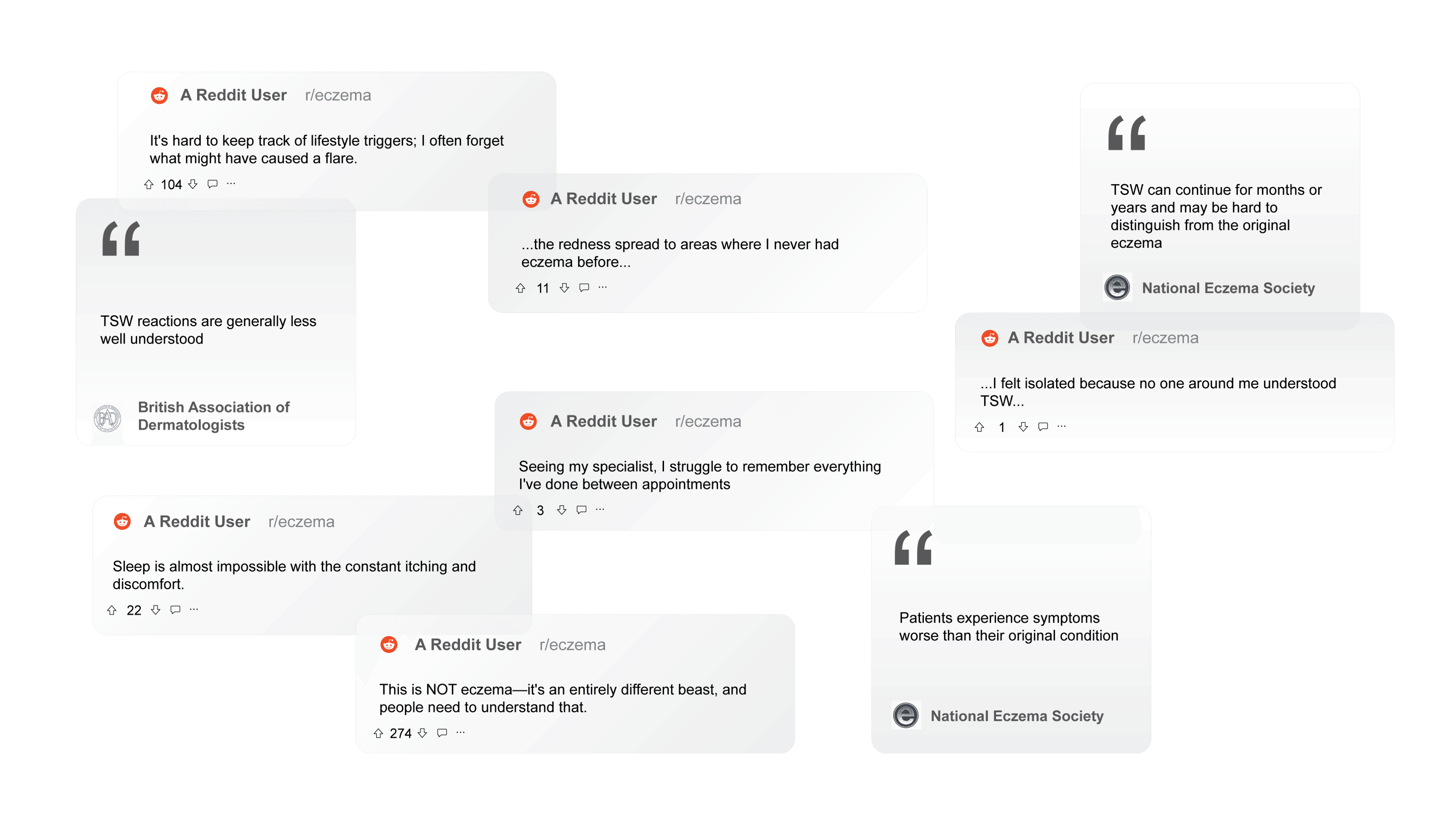
1.0 Online discussions around eczema and TSW
PROBLEM SPACE
Understanding Healthtech
Researching skin tracking apps and user interviews
I conducted thorough competitor analysis to assess the features and functionality of apps on the market. User interviews gave me an insight into eczema sufferers needs, as well as the perspective of a dermatologist. Some simple user personas allowed me to form a well rounded view of a product user. These gave me a greater understanding of possible features required and where an app could fit into the market
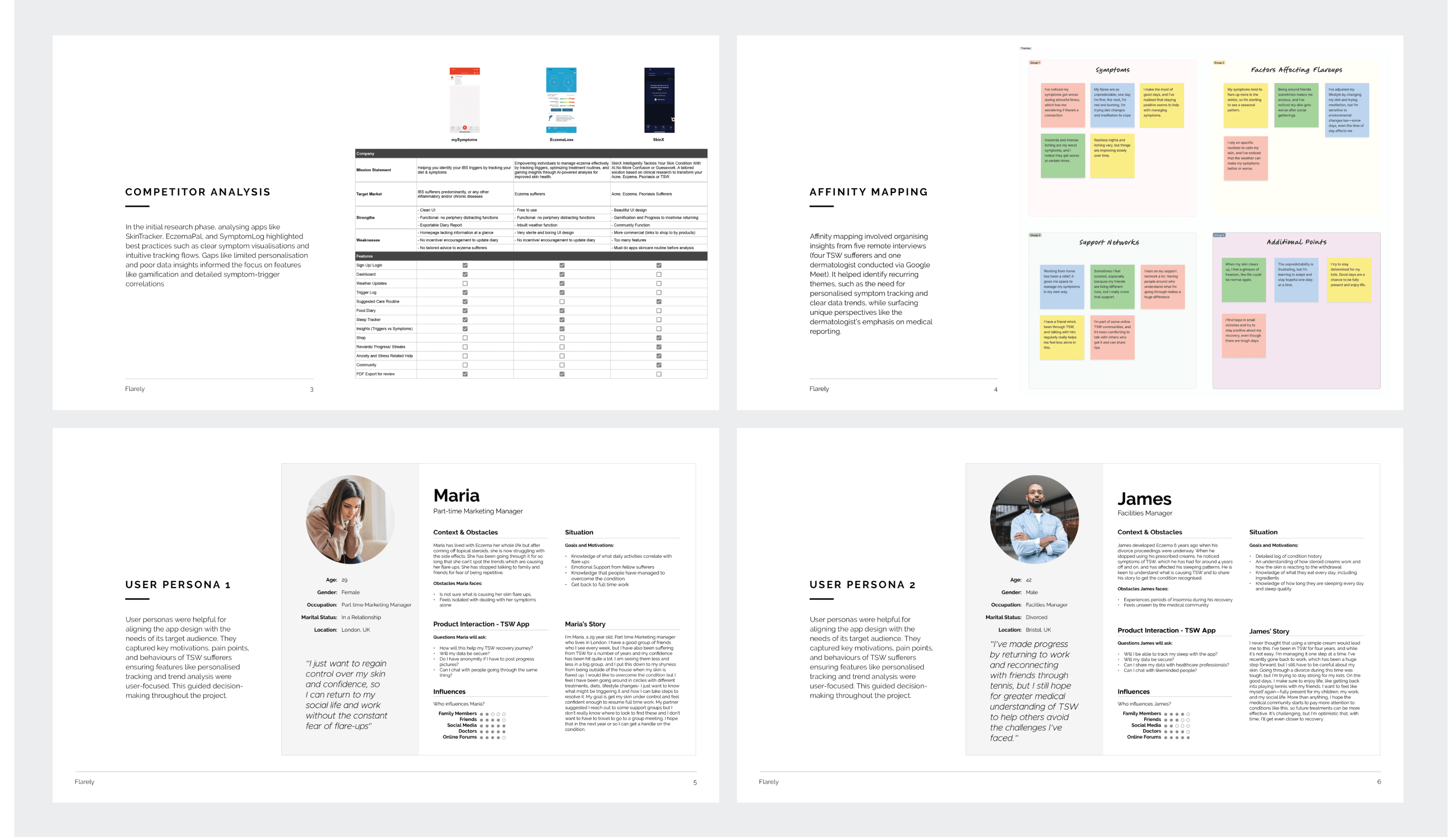
2.0 UX Qualitative Research

Varied Symptoms
A variety of skin related, and other physical symptoms require addressing

The Power of Community
A strong support network allows TSW to be more manageable than suffering alone
A Wide Range of Factors
Multiple diverse factors affecting symptoms are hard to track

The Long Road to Recovery
It takes time, positivity and mental strength to recover fully from TSW
2.1 Key Takeaways
FEATURES & PRIORITISATION
The Product Roadmap
Identifying where user needs and business objectives align
Based off the UX research, I was able to determine where user needs intersected with business goals of the app, which crystallised into the project goals that the app features were required to meet.
After drafting the initial Phase 1 features, I realised the need to streamline efforts to only the essential MVP features. The final version includes basics like signup and settings, along with specialised functions such as trend analysis and diary entries.

3.0 Project Goals & Features Phasing
INFORMATION ARCHITECTURE
The Backbone of the Product
Designing flows in order to create an intuitive and useful product
With the MVP features in mind, I built a sitemap with primary, secondary, and tertiary navigation.
First, I developed the primary navigation, focusing on the main actions users would likely take: diary, symptom dashboard, log activity, insights, and community. Then, I explored and expanded each of these sections for a more comprehensive structure.

4.0 Initial Site Map
Identifying essential user flows
I quickly identified one of the core user flows as being the user onboarding experience and logging their first activity.
The goal was to ensure users could actively engage with the app immediately after download, and then easily log their first activities to engage with the apps core functionality.
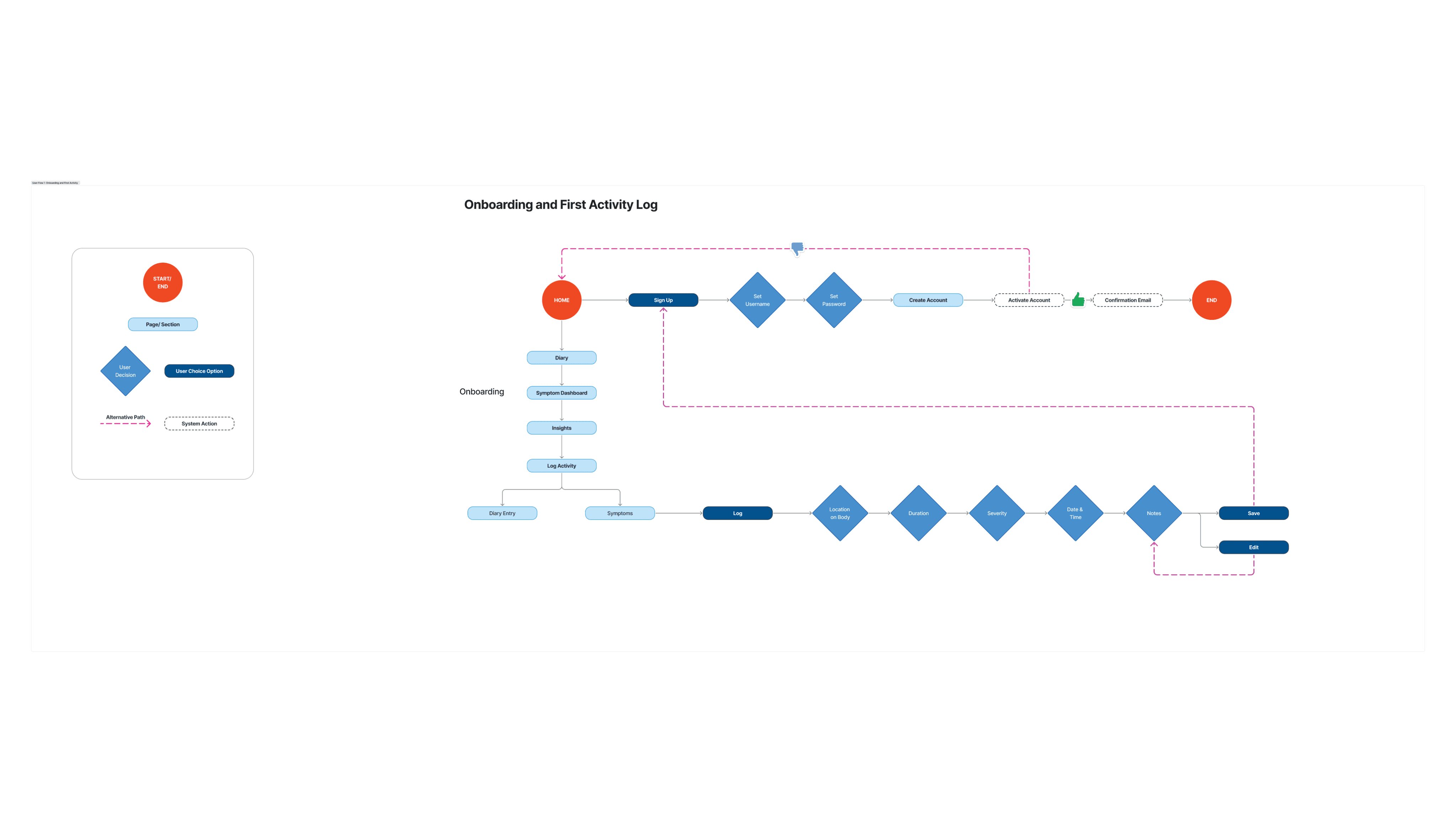
4.1 User Flow 1: Onboarding & Logging First Activity
Flow 1: Onboarding & Logging activity
To avoid cumbersome sign up/ log in screens immediately after opening an app the first time, I made it possible to engage with the apps features of logging a symptom or adding a diary entry, without having to do this until the end.
Making a flow where the user can immediately engage aims to minimise uninstall rates and user frustration while onboarding.
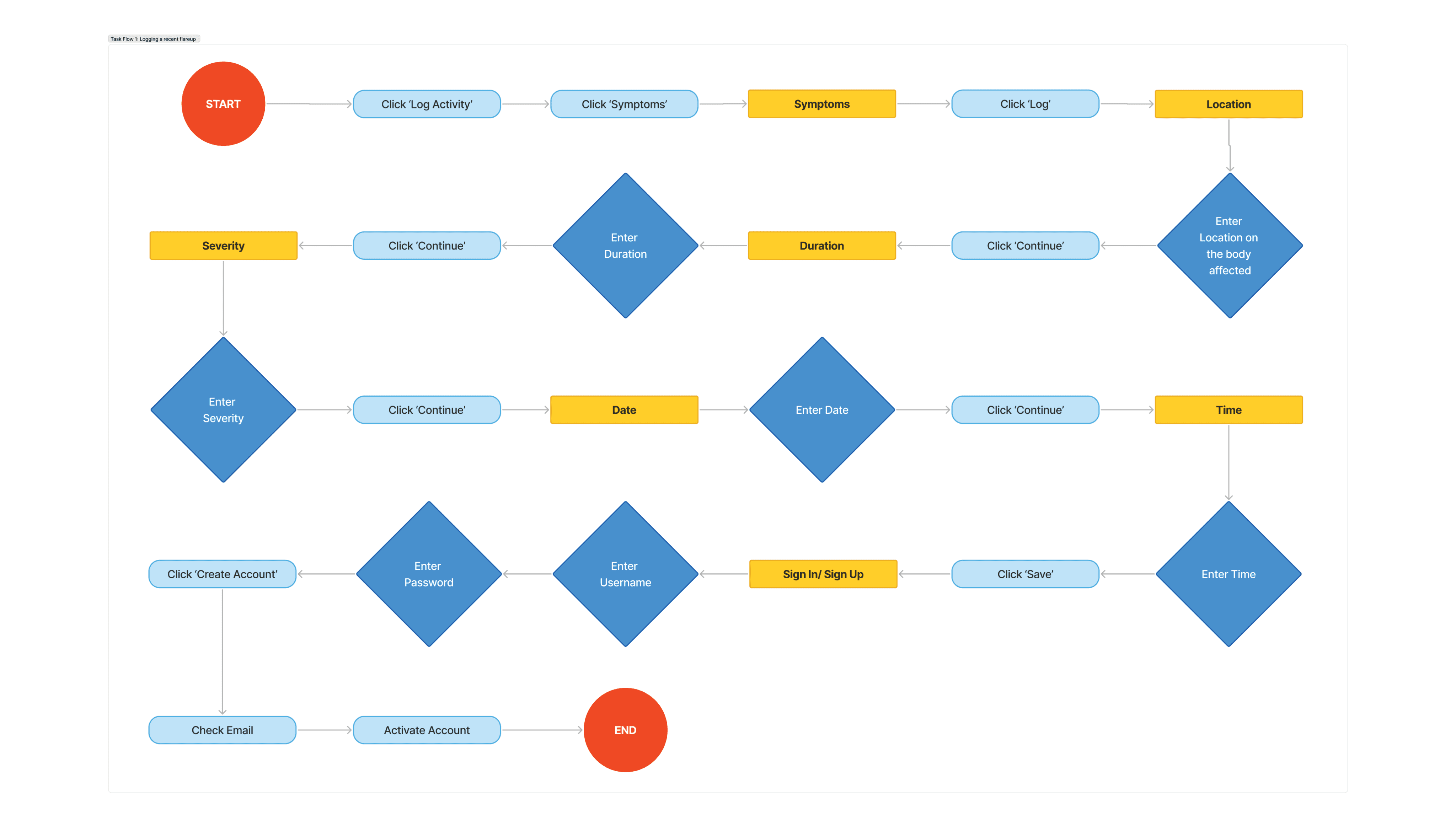
4.2 Task Flow 1: Onboarding & Logging First Activity
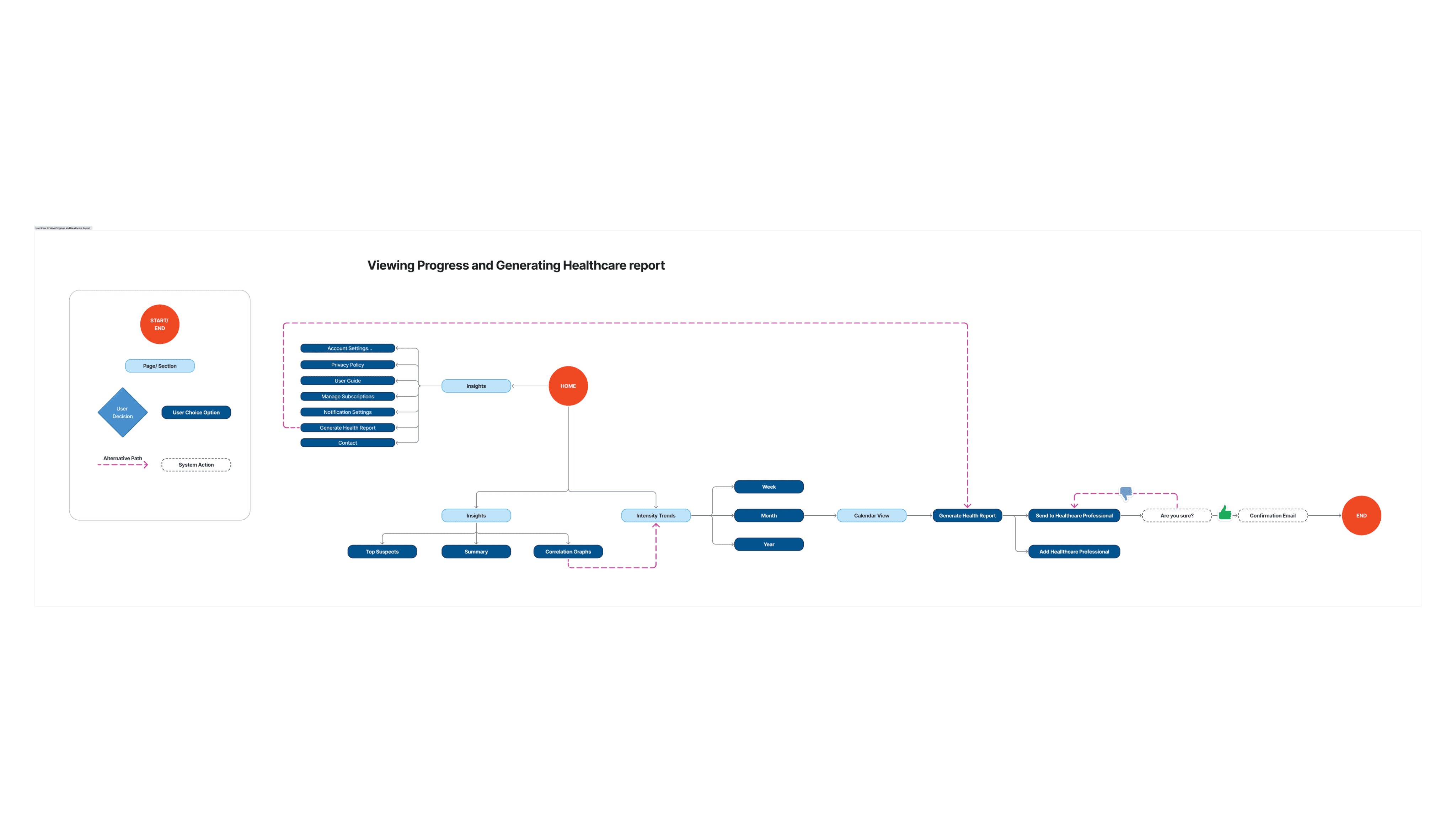
Submitting a Healthcare Report
Another user flow which I identified as core to the app’s functionality was the ability to submit a healthcare report to a GP. This is a PDF export function which compiles the health data from the user inputs
4.3 User Flow 2: Submitting a Healthcare Report
Flow 2: Submitting a healthcare report
I wanted the app to allow users to generate a health report based off the Diary & Symptoms data sets and a selected time period. As part of this flow, Healthcare professional contact details can be added to send the report to.
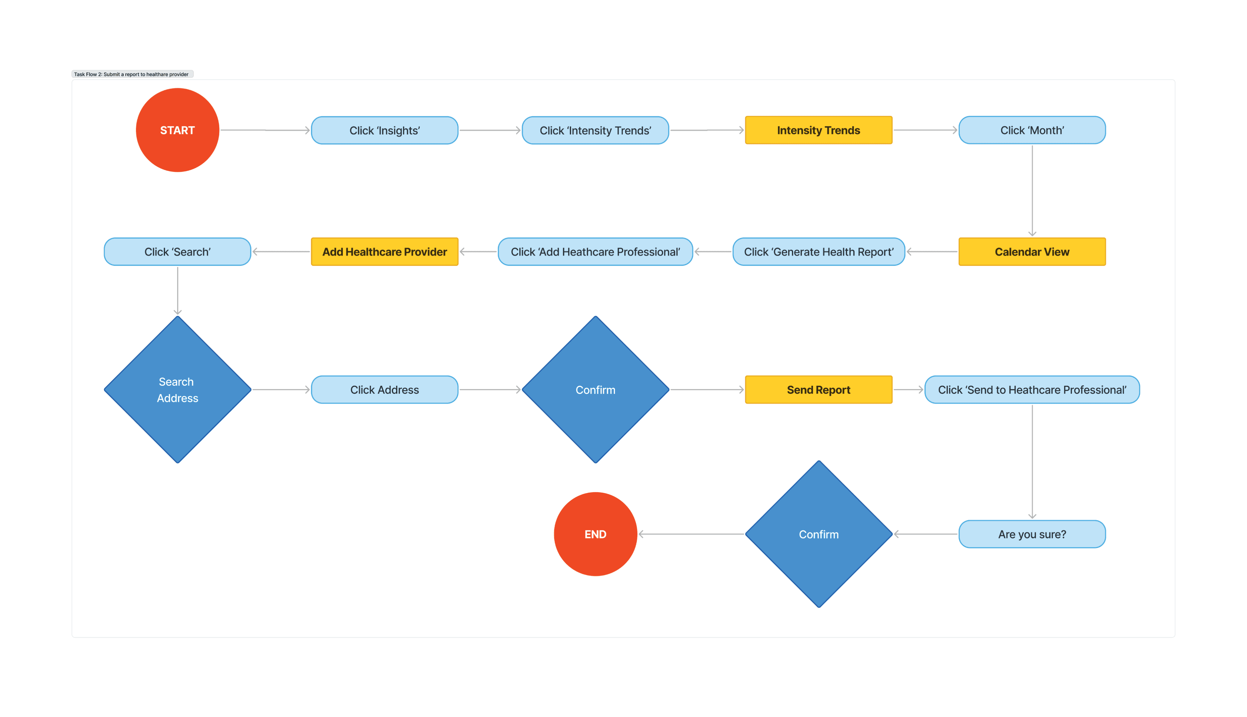
4.4 Task Flow 2: Submitting a Healthcare Report
WIREFRAMES
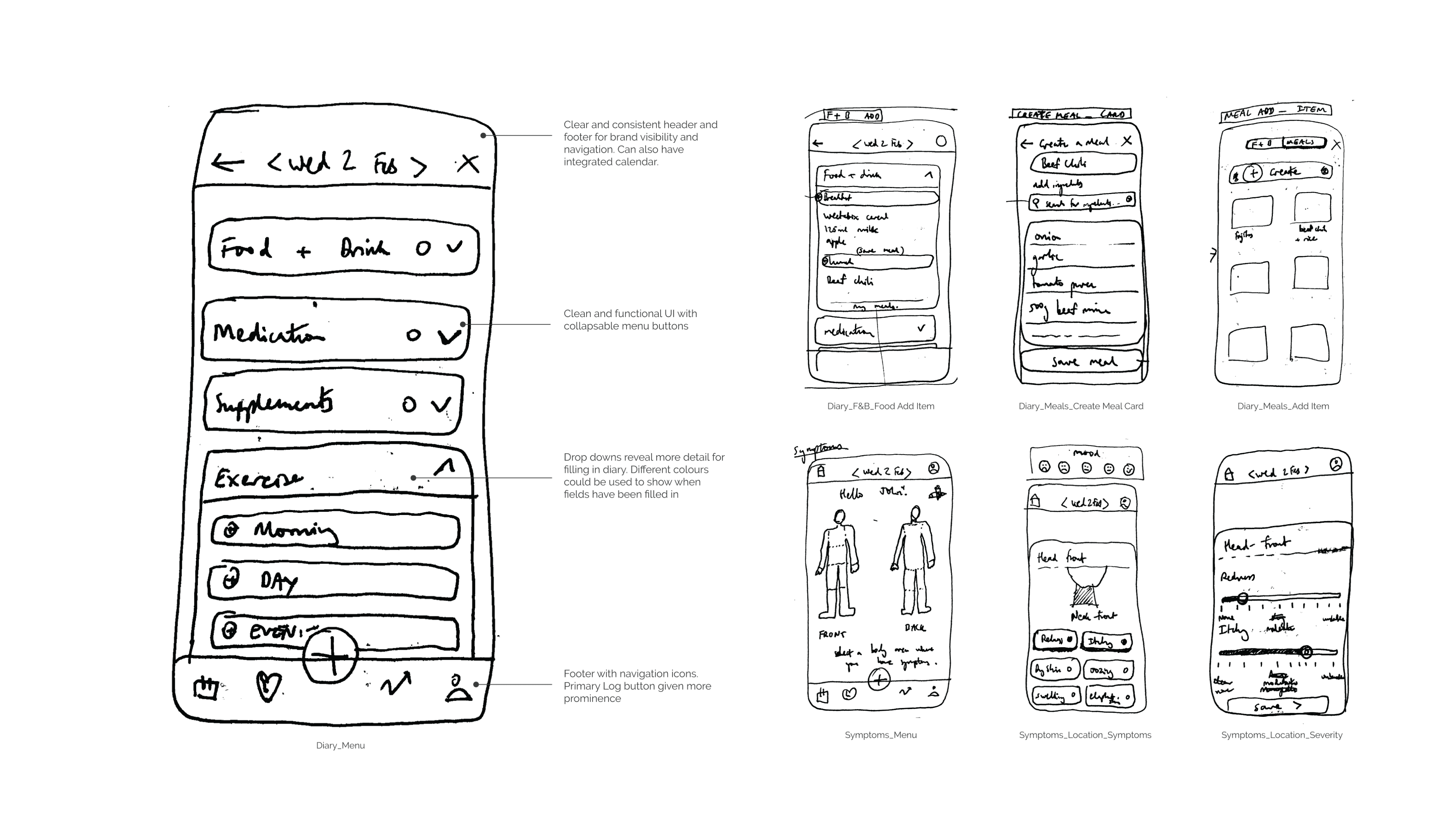
Initial Screen Concepts
Integrating UX research with initial ideas for visuals and navigation
Having established the structure of the MVP, I hand-sketched essential screens and developed a lo-fi prototype covering the Homepage, Logging a Flare, Diary, Symptoms, and Trends.
This provided a comprehensive foundation for early testing, ensuring core functionalities align with user needs.
5.0 Initial Wireframe Sketches
Keep it simple and on task
The initial designs began to emerge organically based off the prior research, with a focus on the apps core functions and visual simplicity. A header for calendar navigation and for exiting screens coupled with a footer to navigate the apps main sections, make up the majority of the screens.
Text is kept to a minimum as I wanted to make the app as visual and legible as possible. As such, a design language of simple buttons and drop down menu fields

5.1 Low Fidelity Wireframes
BRAND IDENTITY
A Healthcare Identity
Contemporary, minimal and trustworthy
For the brand identity I opted to go with a fairly simple colour palette of a mint green and dark blue gradients. This was guided by the app’s core functionality: two predominant user inputs (Diary & Symptoms) with a blended gradient for the trends between them.
I used neutral sans serif fonts for legibility and to keep the clean, minimal look in line with what is expected of a healthcare brand. Muted secondary colours kept the visual styling clean and non-distracting.
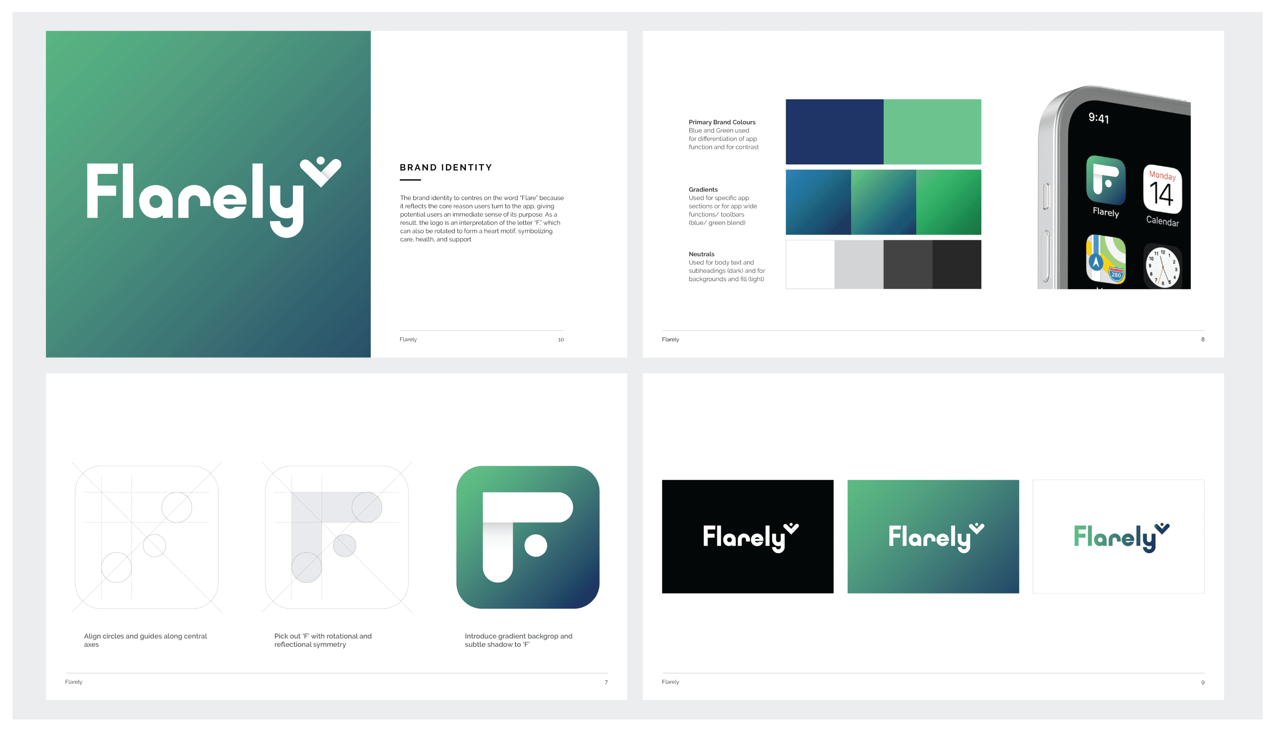
6.0 Brand Identity
VISUAL DESIGN
Applying a UI Toolkit
Creating a design system in advance for efficiency
A clear set of UI components and rules established up front allowed me to design the high fidelity screen with relative ease and speed.
I established a spacing system based off an easily divisible value of 16px, colour palette and sub shades, buttons and their various states as well as a typography system with clear hierarchy.
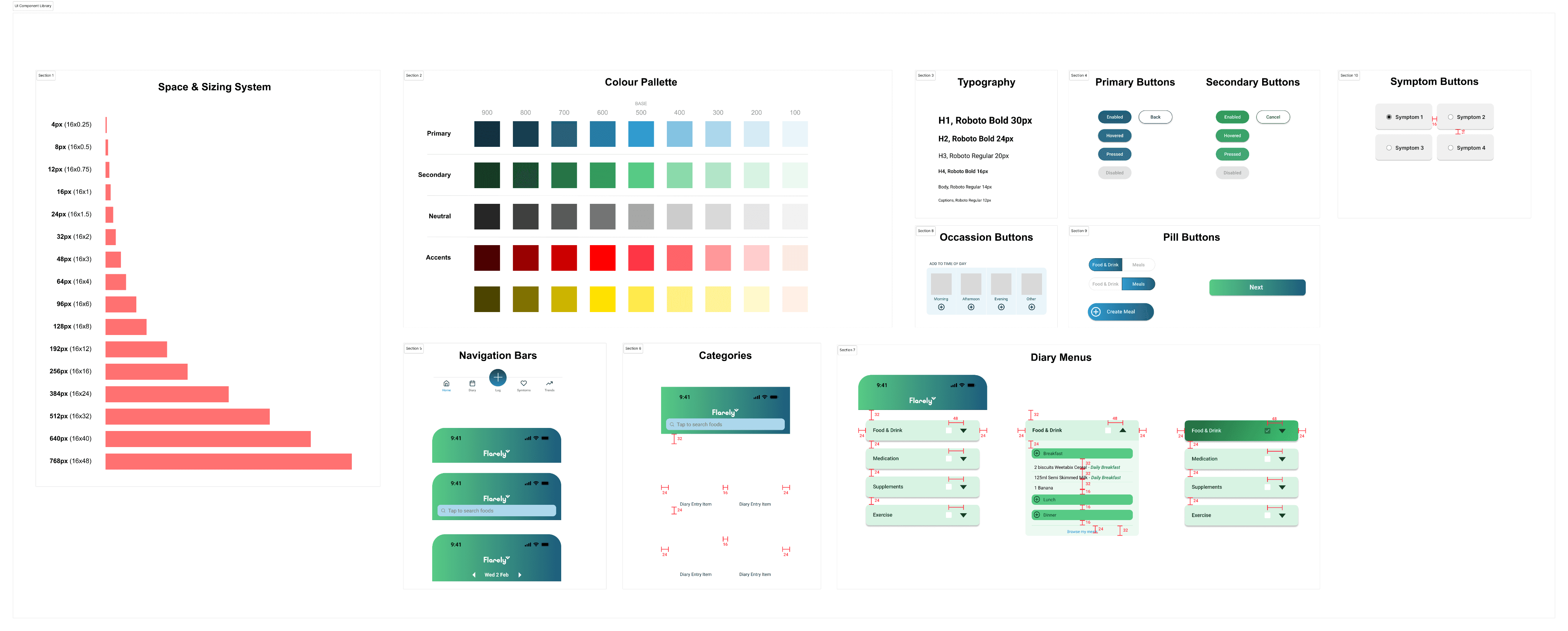
7.0 UI Component Library

7.1 Home Screen Layout Logic
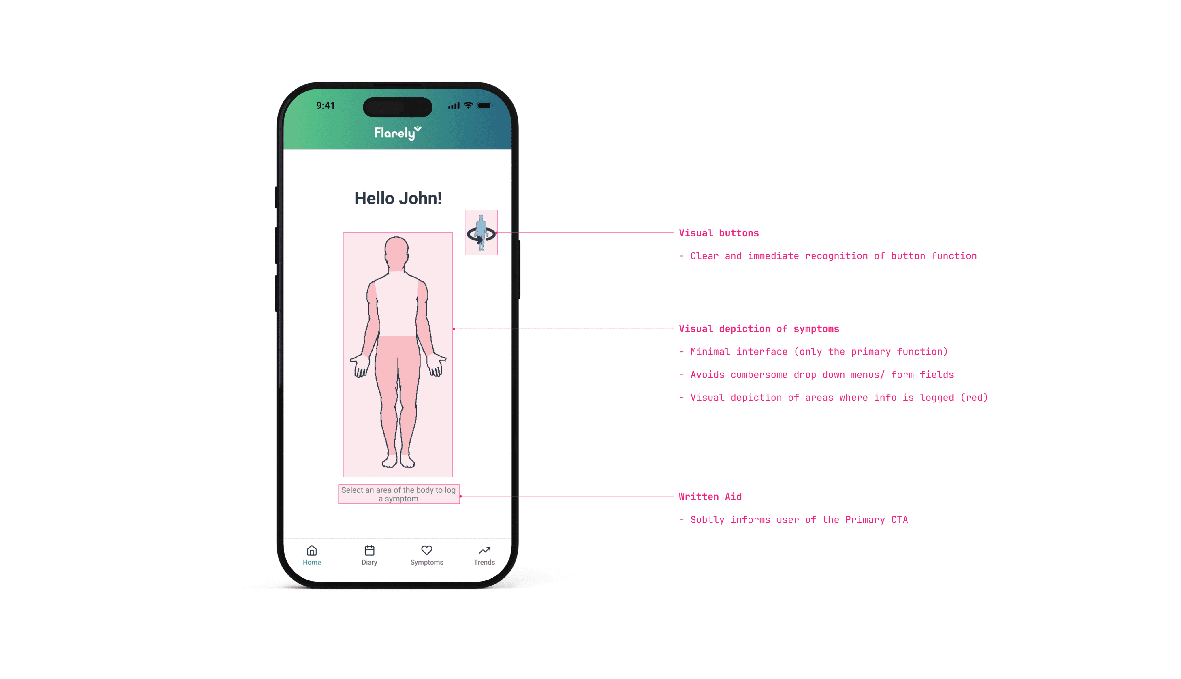
7.2 Symptoms Screen Layout Logic
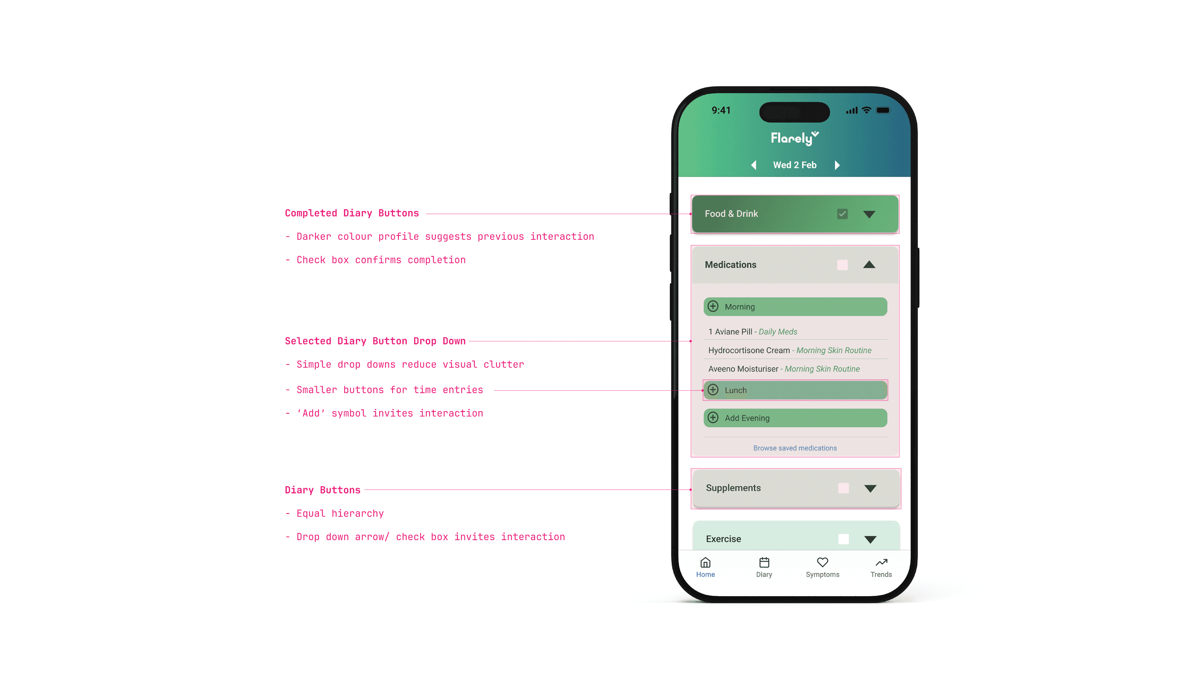
7.3 Diary Screen Layout Logic
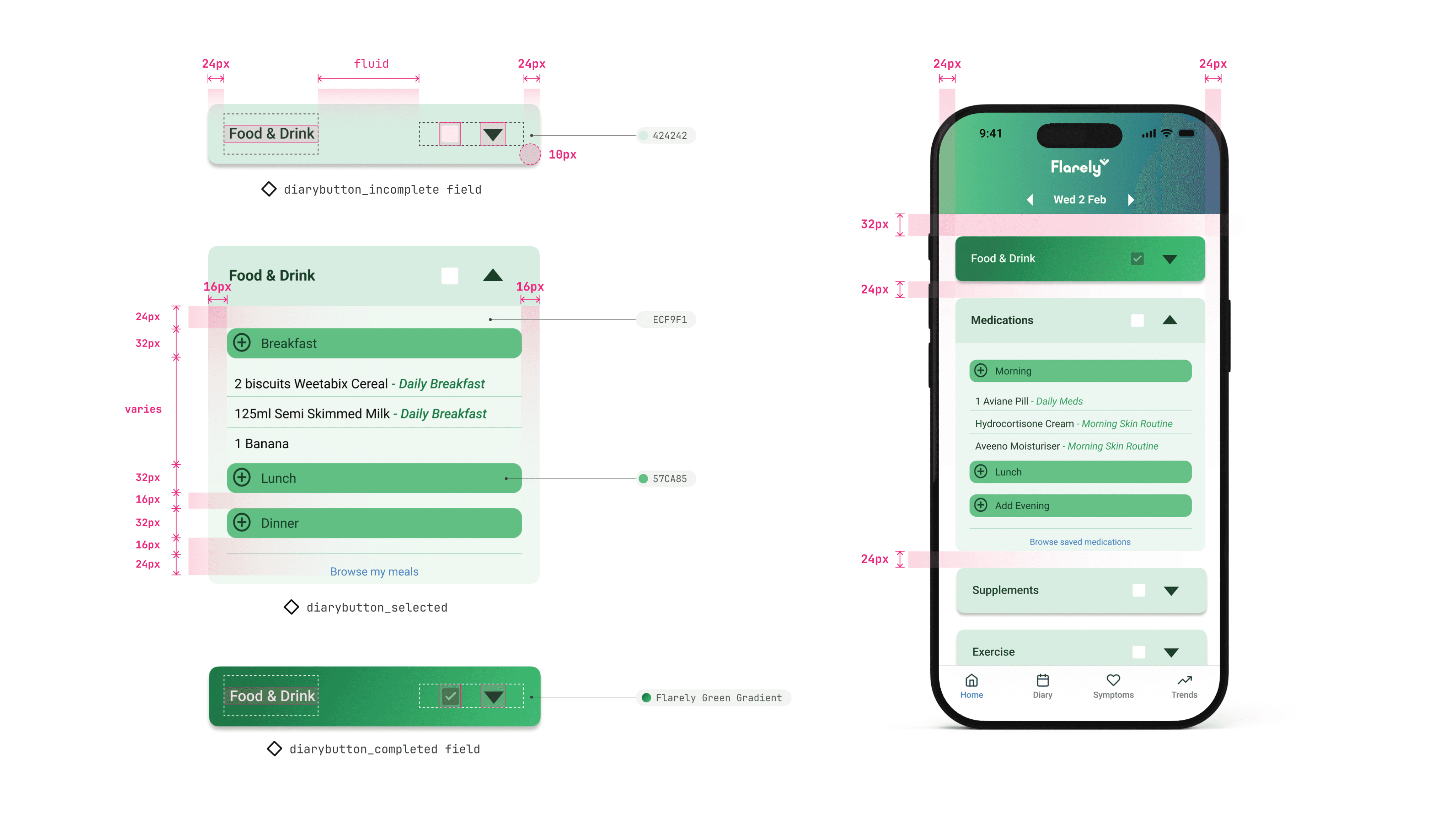
7.4 Diary Button Design
PROTOTYPING
High Fidelity Prototyping
A clickable prototype to test with users
With the addition of the UI, the high fidelity clickable prototype had all the app screens mocked up for the first time, with key user flows available to click through.
I was able to send the Figma files to the initial interviewees from the earlier UX research so they could test the app and let me know any feedback on features they liked and any pain points.
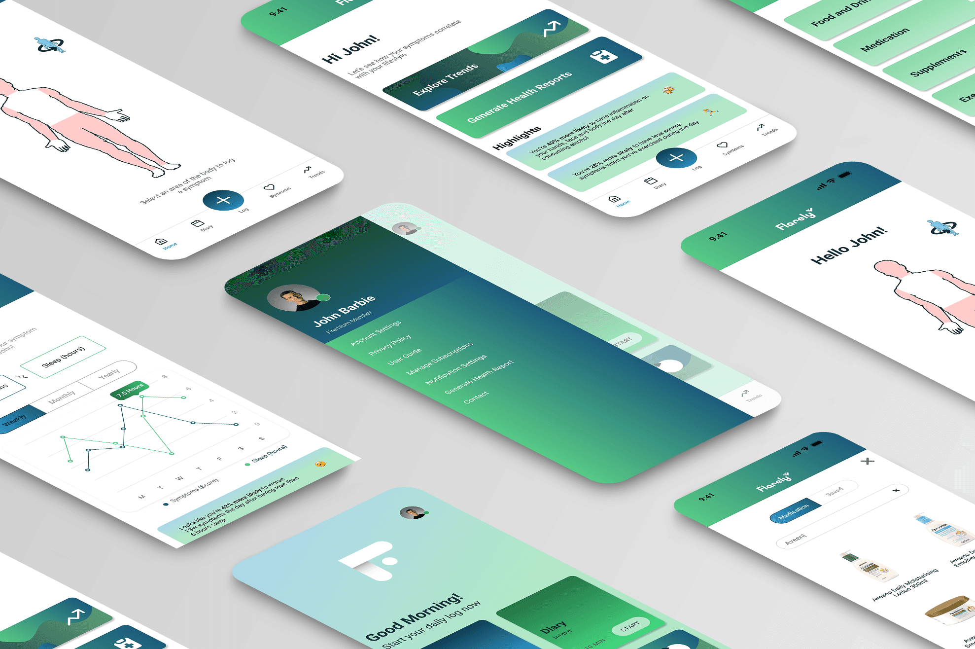
8.0 Clickable Prototype

8.1 App Screens
8.2 Screen Mockup
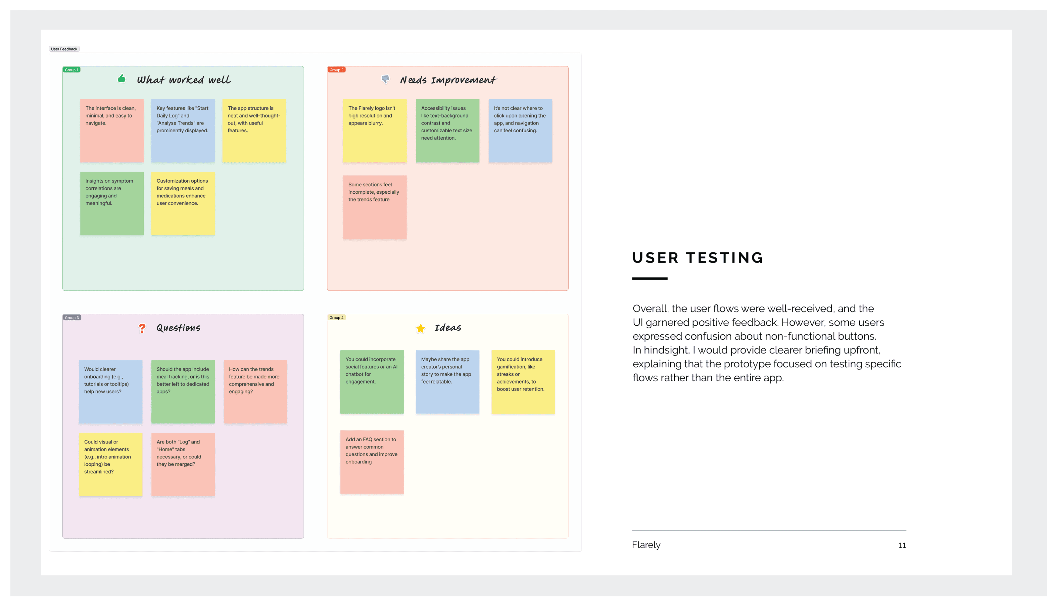
8.3 User Test Feedback
Feedback is crucial for improvement
As the designer, I knew it was imperative to test the prototype with intended users, as this will weed out issues and increase awareness of positive aspects of the design.
The user feedback was varied but some particularly useful aspects were that onboarding could be improved, resolution of the some of the visual components was too low and whether or not the Home and Log pages could be combined.
Some suggestions for possible features came up, but many of these were already in the product roadmap for later phases post MVP.
ITERATIONS
Implementing Feedback
Simplification and enhanced onboarding
Based on the user feedback I implemented a few design changes, mainly to the user onboarding process with some adjusted splash screens and overlaid instructions. The consolidation of pages with almost identical functions was also an obvious iteration for the app design.
9.0 Streamlining Navigation
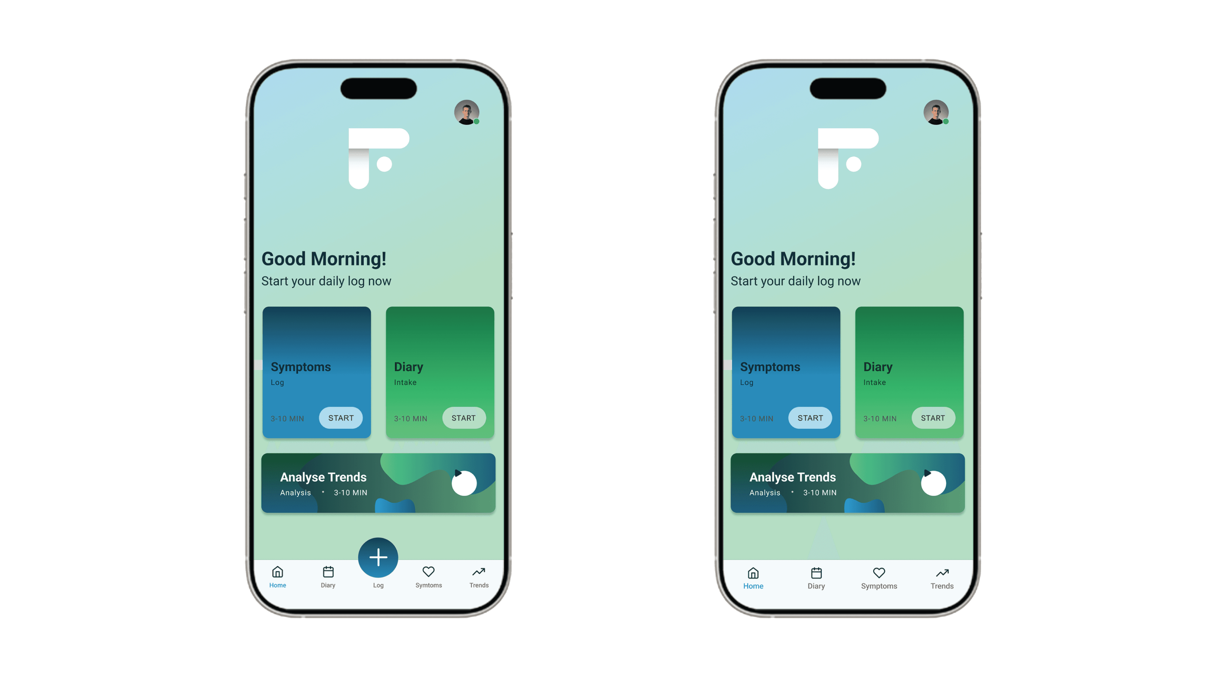
Consolidating pages with similar functions
Although not immediately noticeable when mapping out the initial flows, it turns out the ‘Log’ and the Home Page practically had the same function. As one wasn’t needed, I removed the log screen, which also streamlined the visual appearance of the site footer
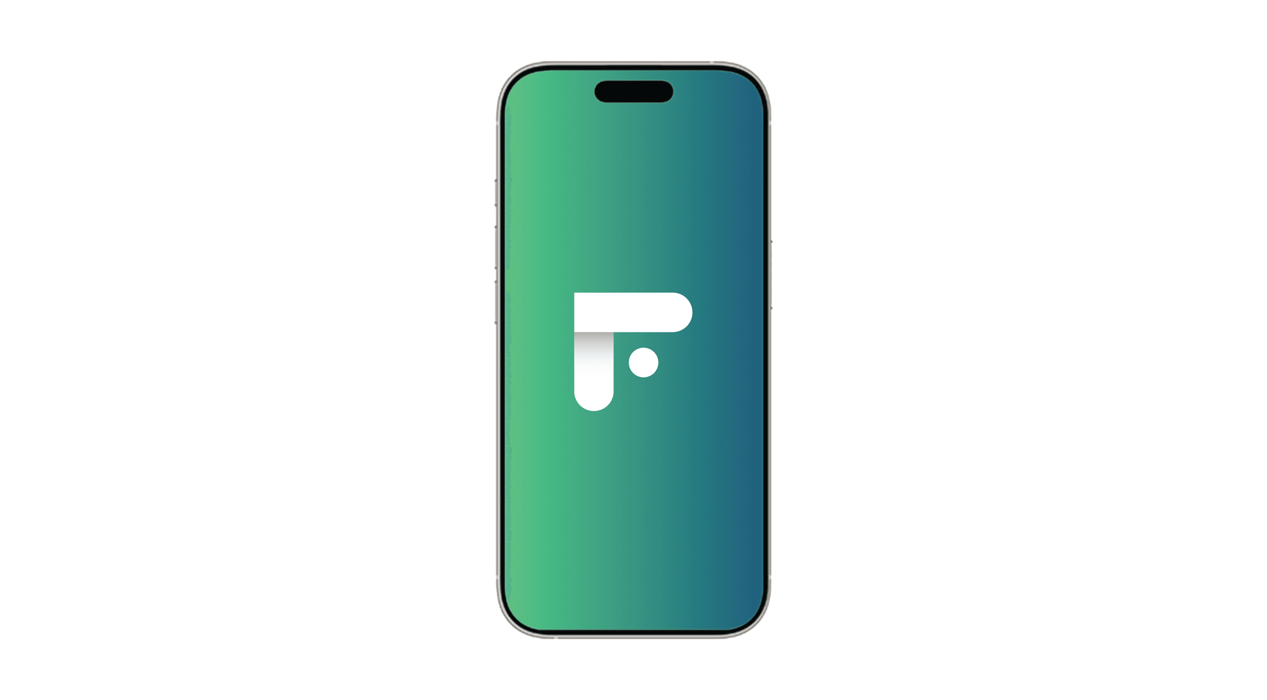
9.1 Simplified Splash Screen
Keep it simple
Where there was previously an animated logo, which users found wasn’t loading properly and looked clunky, I replaced it with a simple logo fade animation.
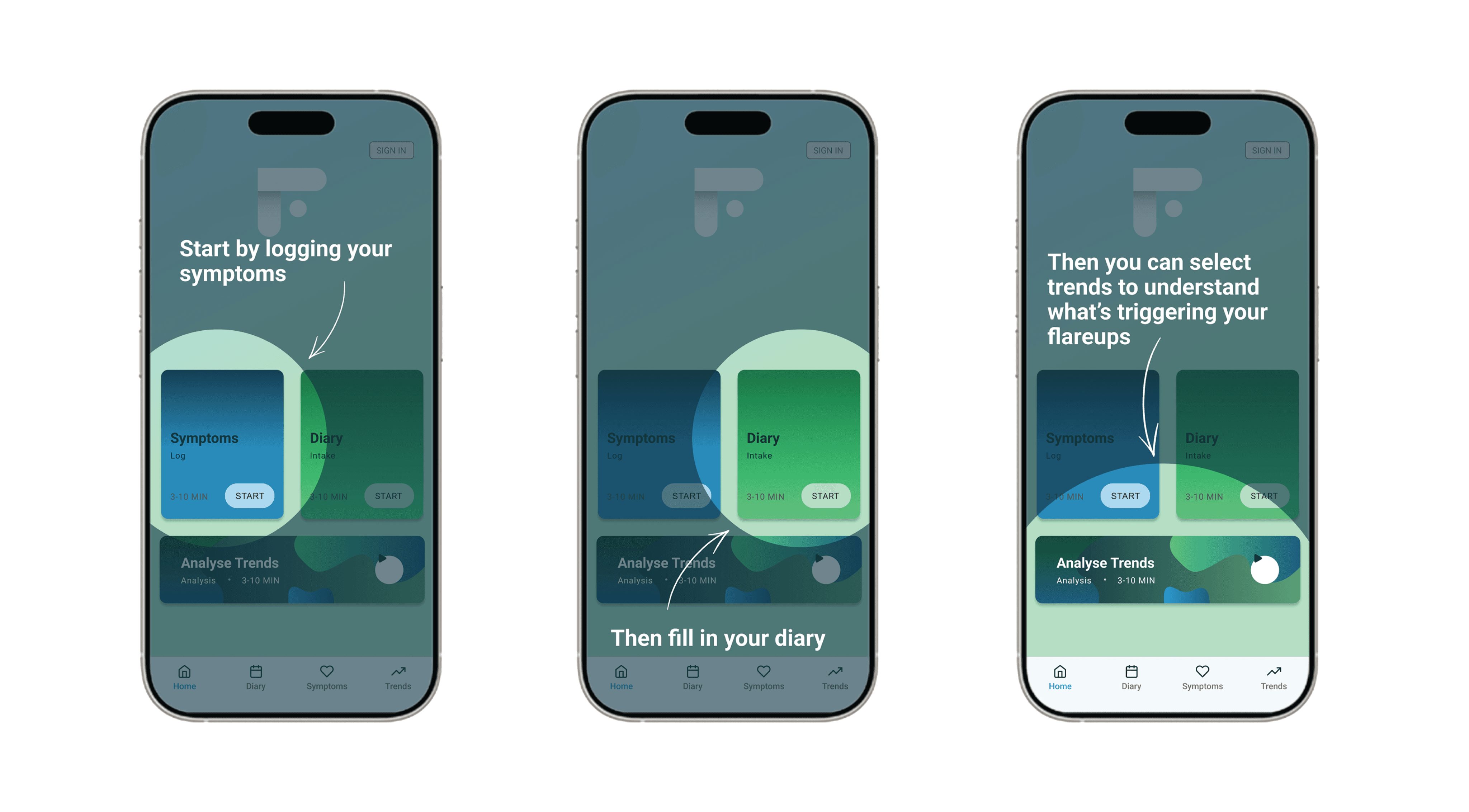
9.2 Enhanced Onboarding
A nudge in the right direction
With equal hierarchy given to the symptoms log and the diary entry, it wasn’t immediately clear what user’s should do upon opening the app for the first time. I included a simple overlay splash screen which nudged the user in the right direction and could be easily clicked through
FINAL DESIGNS
Final Prototype App
End to end clickable prototype
After implementing user feedback, I iterated the design for the required screens and flows so that I had the final clickable prototype app.
The final result was quite successful: meeting the requirements of the initial research with a visually appealing and functional product.

10.0 Final Designs
Project Takeaways:

Iterate & Test Often
Iterative prototyping and user testing revealed critical areas for improvement
Simplify Wherever Possible
Streamlining navigation improved usability and reduced cognitive load for users
Establish Design Rules Early
Using a defined UI toolkit ensured the interface was visually appealing and easy to navigate

Onboarding is Key
Screens explaining functionality significantly enhanced user understanding and engagement
11.0 Project Takeaways